Over 80% of web traffic now comes from mobile devices, and this number continues to rise globally. In 2025, a mobile-first approach isn’t just a trend—it’s the new standard. Users expect seamless experiences on smartphones and tablets, and search engines like Google reward websites that prioritize mobile responsiveness.
In this article, we explore what mobile-first design means, why it matters more than ever, and how it benefits your business or brand.
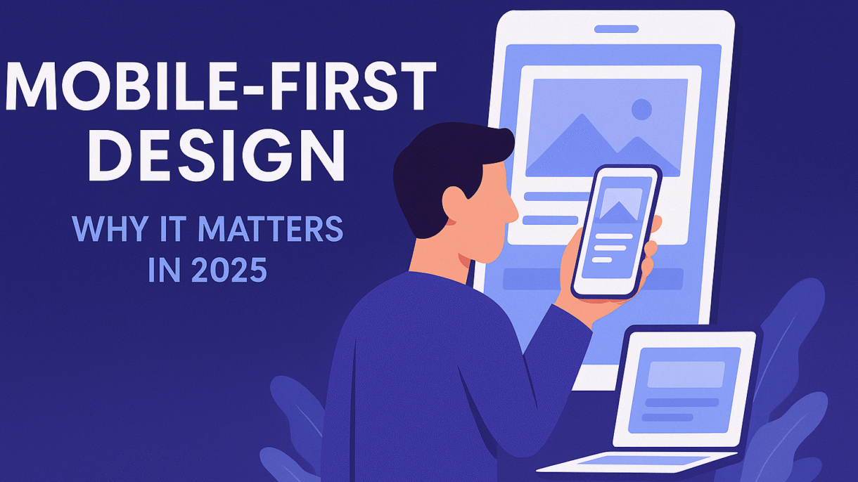
What Is Mobile-First Design?Mobile-first design is a development and design strategy that starts by creating the mobile version of a website before scaling up for larger screens like tablets and desktops. The focus is on simplicity, speed, and usability on smaller devices—ensuring that content and functionality are fully accessible from any screen size.
Unlike traditional responsive design, which often adapts desktop layouts downward, mobile-first begins with mobile users in mind and builds up.
Why Mobile-First Matters in 2025Mobile Usage Is Dominant: Most users now access the web from mobile devices. Ignoring this audience risks losing the majority of your traffic.
Google’s Mobile-First Indexing: Since 2021, Google primarily uses the mobile version of your site for ranking and indexing.
User Expectations Have Changed: Users expect fast, clean, and responsive mobile experiences. A clunky site leads to bounce.
Conversion Happens on Mobile: More users are browsing, comparing, and purchasing directly on mobile than ever before.
Benefits of Mobile-First DesignImproved User Experience: Mobile-first sites are streamlined, easy to navigate, and reduce friction.
Faster Load Times: Optimized mobile designs typically load faster—which helps both SEO and retention.
Higher Search Rankings: Mobile-friendliness is a direct ranking factor for Google.
Increased Engagement and Conversions: Better UX leads to higher conversion rates.
Future-Proofing: As devices evolve, mobile-first design ensures adaptability.
Common Mobile-First Design PracticesResponsive Layouts: Use flexible grids and CSS media queries to ensure design adapts smoothly.
Prioritized Content: Place the most important content at the top. Avoid clutter.
Large Tap Targets: Make buttons and links easy to tap with thumbs.
Readable Typography: Use scalable fonts and avoid small text.
Optimized Images: Compress and serve images in modern formats (e.g., WebP).
Avoid Popups: Especially those that block mobile screens—they harm UX and SEO.
Tools and Frameworks to UseWordPress + Elementor: Build responsive, mobile-optimized layouts with drag-and-drop ease.
Tailwind CSS / Bootstrap: Frontend frameworks designed with responsiveness in mind.
Google Mobile-Friendly Test: Quickly check if your site meets mobile standards.
PageSpeed Insights: Analyze and optimize mobile loading speed.
How I Approach Mobile-First DesignWhen I build websites, mobile-first thinking is always the foundation. I design clean, functional interfaces that perform beautifully on smartphones, without sacrificing quality on desktop. Every project I take on includes:
Fast loading times
Clear navigation
Prioritized content hierarchy
Visually engaging but lightweight assets
I audit every site for mobile responsiveness before launch to ensure that users across all devices get the best possible experience.
Conclusion: Your Site Should Start SmallIn a mobile-first world, your website should be designed for the smallest screens first. This doesn’t limit your design—it sharpens it. If your current site isn’t optimized for mobile, you could be losing traffic, rankings, and revenue.
Looking to redesign your site or audit its mobile performance? Let’s talk and make your website truly responsive—from the first pixel up.
FAQsQ: Is mobile-first the same as responsive design?A: Not exactly. Mobile-first starts with mobile design and expands upward, while responsive design adapts a desktop layout downward.
Q: What if most of my users are still on desktop?A: A mobile-first site still performs beautifully on desktop. You’re simply ensuring mobile users get an optimized experience too.
Q: How can I test my site’s mobile responsiveness?A: Use tools like Google’s Mobile-Friendly Test, GTmetrix, or preview your site across devices using browser dev tools.